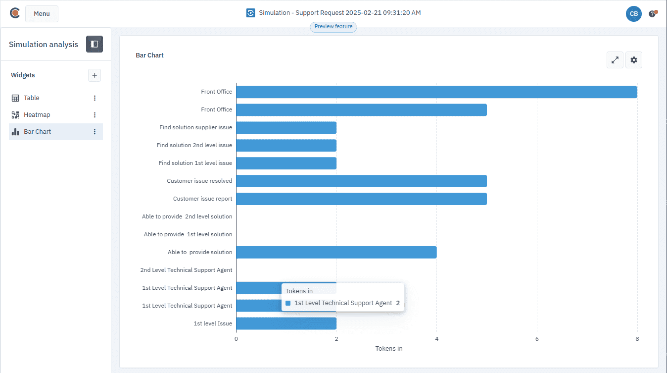
Bar chart
The bar chart widget helps you visualize your simulation results in a horizontal bar chart. This chart allows you to compare the performance of different BPMN elements, helping you to quickly spot trends and outliers in your process.
The bar chart uses two metrics to display your data: series and categories.
Series shows the results you want to visualize, such as tokens in, processing time, cost, or other performance metrics. These are plotted along the X-axis, showing how each BPMN element performs against the selected parameter.
Categories represent the BPMN elements you want to analyze. These are displayed on the Y-axis, representing the different components of your process.
By combining these two metrics, the bar chart gives you a clear, at-a-glance view of how different BPMN elements perform across chosen parameters.
To view the bar chart:
-
Open the simulation results you want to visualize.
-
In the Simulation analysis panel, in Widgets, click
. -
In the Choose a widget pop-up, select Bar Chart.
The widget will appear in the list of widgets within the Simulation analysis panel.
Click
to view the chart in fullscreen mode.
Configure the chart
To configure the chart, you need to select a series — only one can be visible at a time — and choose the categories you want to display.
By default, “Tokens In” is selected, and no categories are shown.
-
Click
. -
In the settings panel, in Series, click
and select the series you want to view. -
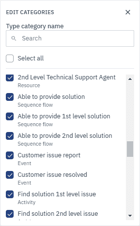
To add categories, click
. -
In the dialog box that opens, add categories one by one or use the Select All option to select all categories.
You can also use the Search feature to quickly find specific categories based on the element type, for example “activity”.
To remove a category:
-
In the settings panel, click
next to the category. This will deselect it, and it will no longer appear in the chart. 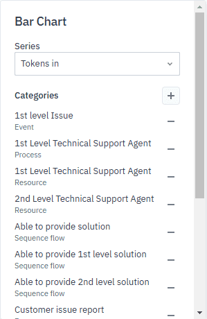
View values
To view the value for each element, hover over a bar. The value will display, showing the performance of the BPMN element relative to the selected metric.