Analyzing simulation results
After running the simulation, the next step is to dive into the results. This phase is all about understanding what the data reveals and using it to improve your processes.
We’ll show you how to effectively analyze your simulation data. You’ll learn how to use and customize different visualization tools, such as a table, heatmap and bar chart, to pinpoint key performance parameters and areas for improvement. By the end, you’ll be able to make data-driven decisions and optimize your process based on the insights gained from the simulation.
We’ll continue with our pizza delivery example and explore how to analyze the collected simulation data.
Get started by accessing the simulation results for the pizza delivery process:
-
In the header, click Menu and select Simulations.
-
Click Delivery - 2 drivers, or click
and select View Results.
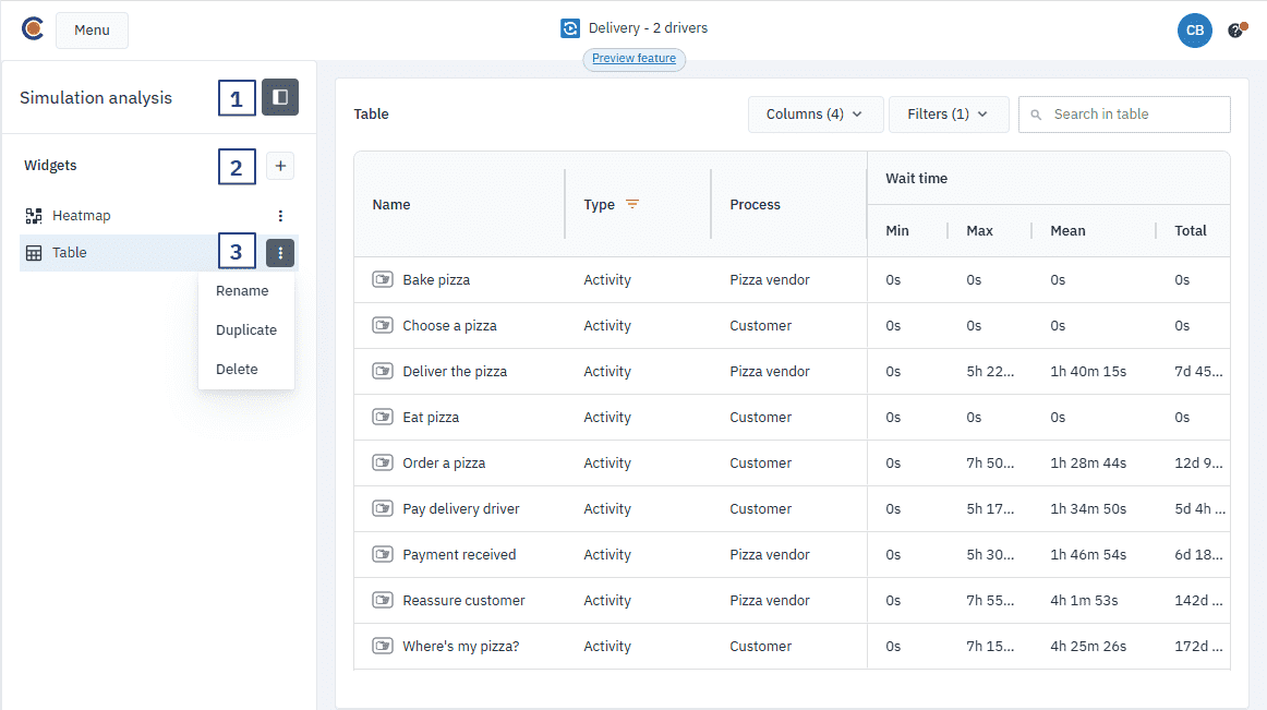
Simulation analysis interface
The simulation analysis interface is where you’ll find all the tools you need to review and analyze your results. It’s designed for ease of use, so you can quickly switch between data visualizations and adjust settings as needed.
Here’s an overview of the key elements of the analysis interface:
-
Show or hide the Simulation analysis panel
Quickly hide the visibility of the simulation analysis panel to declutter your workspace when you don’t need it.
-
Add widgets
By default, your simulation results are displayed in a table and a heatmap within the simulation analysis panel, with the option to also view the results in a bar chart. To highlight specific aspects of your data, you can add multiple widgets to gain different perspectives on the results.
-
Rename, duplicate and delete widgets
You can personalize the interface by renaming widgets to better reflect the data they represent. If you want to analyze different outputs you can duplicate a widget for side-by-side comparisons. If you no longer need a widget, you can delete it easily. These actions are personal to you and won’t affect other users’ views of the project.
Understanding output parameters
To gain meaningful insights from your simulation, it’s essential to focus on the outputs that influence your process outcomes. The output parameters available in the table, heatmap and bar chart widgets provide a unique perspective on the performance of your process.
Each output provides various parameters that give you a deeper understanding of your process. Below are the key outputs you can track, along with the specific parameters for each:
| Output | Description | Parameters |
|---|---|---|
| Tokens | This shows the flow of tokens entering each element in the process, highlighting where the process is most congested. High token values signal bottlenecks or areas of excessive workload. | In, Out, Waiting. |
| Queue length | This indicates how many tokens are waiting to be processed. Longer queues suggest delays in handling. | Min, Max, Mean |
| Processing time | Displays how long each task takes to process, based on the time you set. | Min, Max, Mean, Total |
| Duration | Reflects the total time it takes for a task to be completed, from start to finish. | Min, Max, Mean, Total |
| Wait time | Represents how long tokens are waiting before they are processed due to an insufficient number of available resources. Excessive wait times often highlight delays or slow steps in the flow. | Min, Max, Mean, Total |
| Lag time | The time that passes between the completion of a task and the start of the next task. | Min, Max, Mean, Total |
| Elapsed time | Tracks how long it takes for a task to be completed relative to the total simulation time. This parameter helps gauge overall process efficiency. | Min, Max, Mean, Total |
| Costs | Displays the costs associated with each task. This is helpful for identifying areas where you may be overspending. | Fixed, Unit |
| Resources used | Shows the number of resources used for each task. This helps you assess resource utilization and identify inefficiencies or overuse. | Min, Max, Mean |