Confirming bottlenecks with the bar chart
The bar chart widget helps you visualize your simulation results in a horizontal bar chart, making it easy to compare the performance of different process elements. This chart helps you quickly spot trends and identify outliers in your process.
The bar chart uses two types of information to display your data:
-
Series shows the results you want to visualize, such as tokens in, processing time, or cost. This data is plotted along the X-axis.
-
Categories represent the BPMN elements you’re analyzing. These are shown on the Y-axis.
By combining these two types of information, the bar chart gives you a clear, at-a-glance view of how each BPMN element performs against the selected parameter.
Analyze wait times for activities
The bar chart complements our analysis of the heatmap and table by providing a visual comparison of how long each task takes to complete.
To confirm that the Deliver the pizza has insufficient deliveries to be process, we’ll use the bar chart to identify it as the main bottleneck in the process.
To begin our analysis, we need to add the bar chart widget to the simulation analysis panel.
-
In the Simulation analysis panel, in Widgets, click
. -
In the Choose a widget pop-up, select Bar Chart.
The widget will appear in the list of widgets within the Simulation analysis panel.
Configure the bar chart
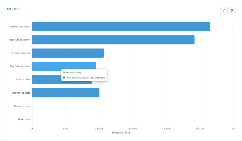
We’ll set the “Mean wait time” as the series and “activities” as the category to compare the average wait time for each activity. We’ll include all activities except for Eat the pizza, as it doesn’t reflect the pizza vendor’s role in the process.
Note that the longer the bar, the greater the mean wait time for that task, making it easy to spot delays or bottlenecks.
-
In the bar chart, click
to open the settings panel. -
In Series, click
and select Mean wait time. -
In Categories, click
. -
In dialog box that opens, type activity in the search field and select all the activities except for Eat the pizza.
Using the search function helps to streamline the selection process, making it easier to focus on the elements we want to show.

Interpret the chart
By hovering over a bar in the chart, you can see the value for each activity. This visualization confirms that the Deliver the pizza task is where inefficiencies are occurring, with a mean wait time of 1 hour, 34 minutes and 50 seconds. This aligns with the insights we gathered from the heatmap and table, giving us a clear, data-driven picture of the inefficiencies in the process.