Visualizing performance with the heatmap
The heatmap widget is a powerful tool for visualizing the results of your simulation, making it easy to spot patterns and performance trends. Using a color scale, the heatmap highlights process elements based on the magnitude of the selected output. Hotter colors (red) represent higher values, while cooler colors (green) indicate lower values. This color-coded view helps you quickly identify areas of concern and focus your attention where it matters most.
Identify bottlenecks with Token outputs
When you first open the heatmap, the default view shows Tokens In. This output is useful because it shows where tasks are accumulating excessive tokens, signaling potential delays or bottlenecks in the process. For example, in the Where’s my pizza? and Reassure customer tasks, you’ll notice orange areas, indicating a high number of tokens in. This suggests a significant number of customers are calling about late deliveries, creating a bottleneck.

You can visualize Tokens In data by selecting a task in the process. A pop-up will display the number of tokens flowing to the task. You can see additional token parameters by expanding the pop-up.
-
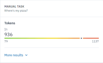
Select the Where’s my pizza?.
A pop-up opens, showing data for the selected output — in this case, Tokens In.
-
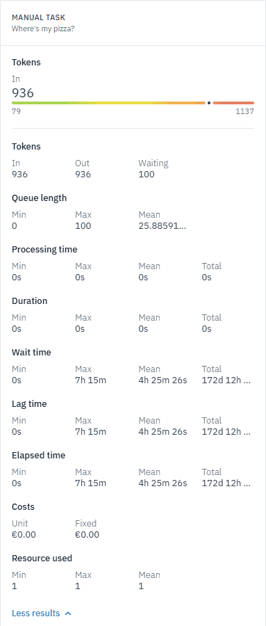
Click More results to view additional parameters.
Interpret the results
By examining the Tokens In, Tokens Out, and Waiting parameters, you can gain a clearer picture of each task’s performance. For example, the high number of tokens waiting in both the Where’s my pizza? and Reassure customer tasks highlights a significant bottleneck. These tasks are not processing customer calls quickly enough, creating delays in the process.
When we compare the data for the Where’s my pizza? and Reassure customer tasks, we get the following:
-
Tokens In: The number of tokens entering the task, indicating how many instances are reaching this point in the process. For example, the Where’s my pizza? task has 936 tokens in, meaning 936 instances of late delivery triggered customer inquiries. The Reassure customer task has 849.
-
Tokens Out: The number of tokens leaving the task, showing how many instances are progressing through the process. The Where’s my pizza? task shows 936 tokens out, indicating that all the customer inquiries were processed and resolved. The Reassure customer task has 848.
-
Waiting: The number of tokens still waiting within the task, indicating a backlog. The Where’s my pizza? task shows 100 tokens waiting, meaning there are still unresolved customer calls creating a delay in the process. Similarly, the Reassure customer task has 87 tokens waiting, indicating a delay in responding to customers.
Customize the heatmap for focused analysis
To better focus on specific outputs while analyzing your processes, you can customize the heatmap names to reflect the output it visualizes — for example, “Tokens In”.
-
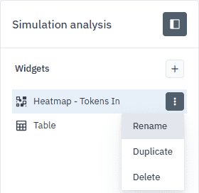
Click
next to the widget and select Rename. -
In the dialog box that opens, rename the widget to Heatmap - Tokens In, then click Rename.
Any changes you make to the heatmap are only visible to you. These updates are personal and won’t affect what your collaborators see in the project.
Combine the heatmap with the table
Since the heatmap is purely visual, it works best when combined with other data views, such as a table. Together, these visualizations help you piece together a fuller understanding of your simulation results. The heatmap will guide you to the areas that need attention, and you can then focus on more specific outputs to refine and optimize your process in the table.
While the heatmap highlights areas needing attention, the table provides a more detailed, data-driven view, enabling you to analyze specific outputs and further refine your process.