Taking a closer look with the table
The table widget provides detailed information on the performance of each element in your process. It offers deeper insights into your simulation’s outputs, helping you analyze each step of the process in greater detail.
The interactive table makes it easy to filter rows, hide or show columns, and sort data in ascending or descending order, giving you full control over how you view the information.
Analyze wait times and flow with the table
While the heatmap gives a visual overview of where bottlenecks and delays are occurring, the table provides a more granular, data-driven perspective on simulation performance. By diving deeper into the data, you can better understand exactly where delays, bottlenecks and inefficiencies are occurring and why.
For example, let’s examine the results of the pizza delivery simulation, specifically focusing on the bottleneck created by the “Where’s my pizza?” and “Reassure customer” tasks. By analyzing the mean wait time, we can assess how these tasks are performing and identify areas for improvement.
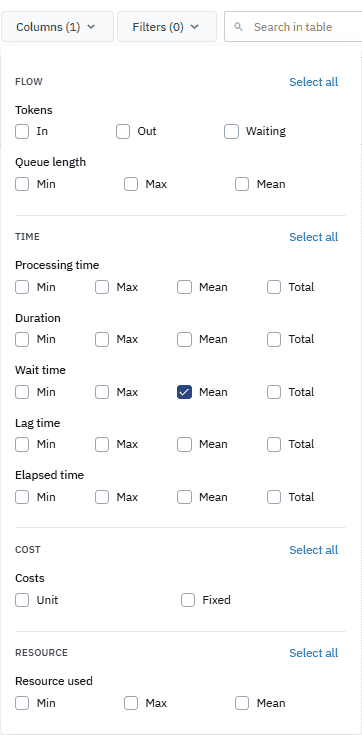
We’ll start by customizing the columns to display and applying filters to rows in the default table to show the mean wait times for activities in the process. This will help us identify which parts of the delivery process are taking longer than the expected wait time and see which resources are affected.
-
In the Simulation analysis panel, click Table.
-
In the table toolbar, select the Columns filter.
-
In the dialog box that opens, deselect all the columns except for Wait time — Mean.
-
In the table header, in the Type row, click
. -
In the context menu that opens, click
to the Contains filter and in the search field, type Activity. 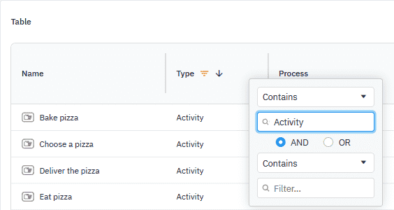
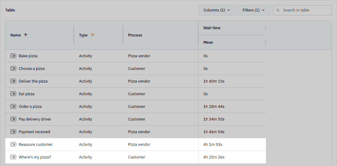
With these filters in place, we can see that the mean wait time for the “Where’s my pizza?” task is 4 hours 25 minutes and 26 seconds. Likewise, the “Reassure customer” task shows a concerning wait time of 4 hours, 1 minute and 53 seconds.
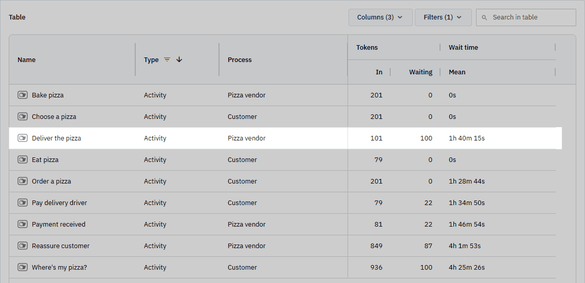
By adding flow data to the table — specifically tokens in and tokens waiting — the “Deliver the pizza” task stands out with 101 tokens in and 100 tokens waiting with an average wait time of 1 hour, 40 minutes and 15 seconds. This analysis allows us to exactly pinpoint the origin of the delays.
- Add the Tokens In and Tokens Waiting columns.
Based on the data from the table, it’s clear that the delivery driver resource is the primary area where we can take action to improve performance. The extended wait times in both the “Where’s my pizza?” and “Reassure customer” tasks, along with the flow data showing a backlog in the “Deliver the pizza” task, highlight a strain on delivery capacity.